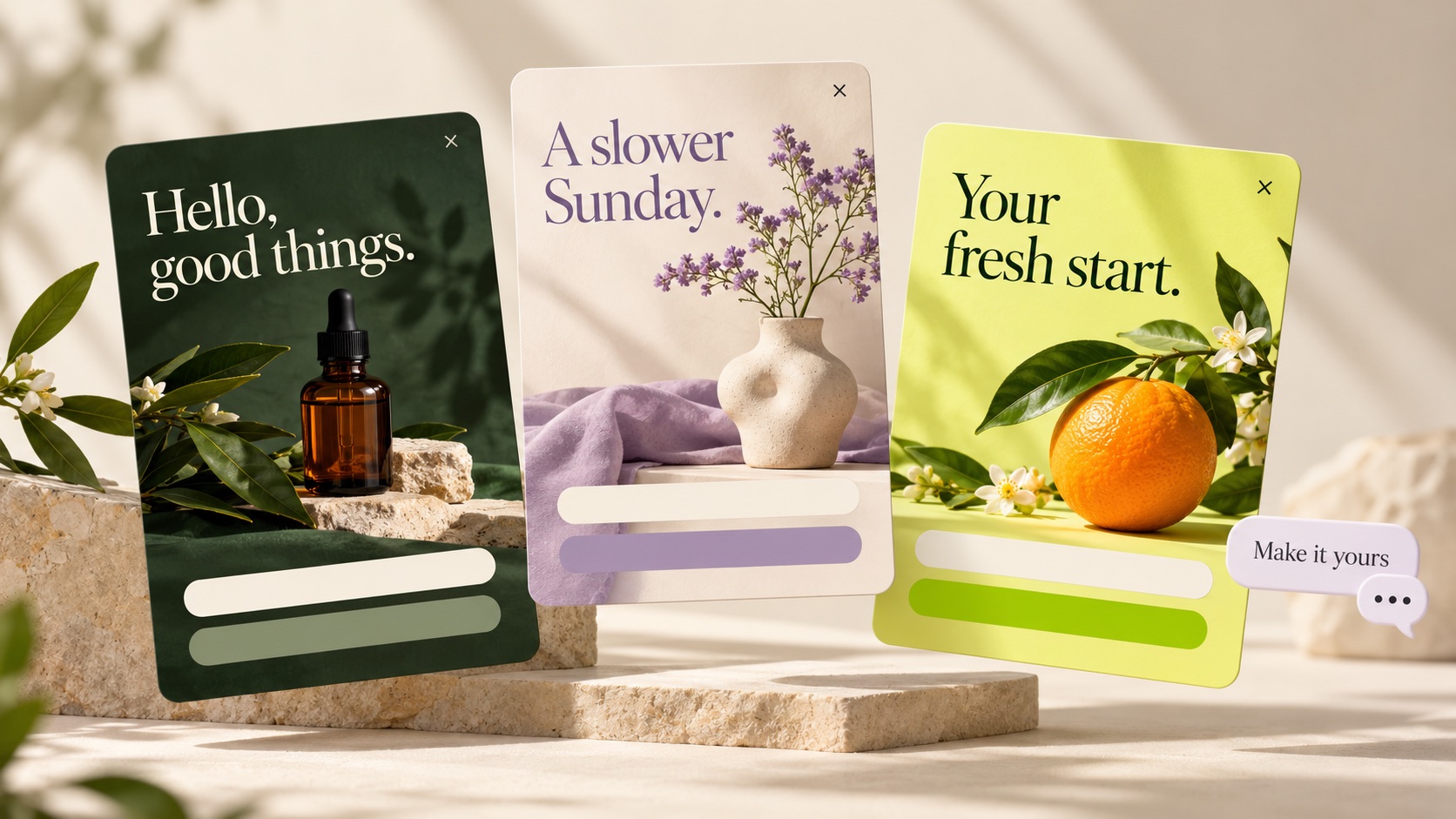
What is a multi-step popup?
A multi-step popup divides an interaction across two or more screens. One screen might explain an offer, the next collects an email and a final screen confirms what happens next. Each step should have a clear job, and the visitor should understand what they are being asked to do.
Extra screens do not automatically improve conversion. They can make a complex form easier to follow, but they also add transitions where someone may leave. Choose the shortest sequence that serves your campaign.
If you want a concrete creation workflow, the AI popup tutorial shows actual edits, mobile review and the installation checks needed to get a signup working.
Three useful multi-step popup patterns
1. Offer → email → confirmation
Explain a genuine benefit before asking for a contact. Collect the email on the next screen, then show a useful confirmation. For a welcome discount, supply a real code and test it in your store. Do not imply that showing the code creates a working checkout discount.
Illustrative copy: “Get a first look at our new collection” → “Where should we send the announcement?” → “You're on the list. We'll email when the collection opens.” The store must arrange that follow-up.
2. Preference → contact → confirmation
Ask one question your team will use, such as a product interest. Then collect the contact and confirm the request. Keep the question short and the options clear. A preference field does not automatically create a recommendation engine or a personalized email sequence.
3. Email → optional phone → confirmation
Consider this only when you have a reason to collect a phone number and an appropriate messaging workflow. Make the optional nature clear, explain the communication and provide a working way to continue without the number. Test that the email-only path succeeds. Phone capture does not itself configure SMS delivery.
These are planning patterns, not claims that every template supports every transition or skip behavior. Verify the actual flow you build.
Give each step one job
Write the information you need and why you need it. Remove fields that have no clear use. For a simple newsletter, an email field and confirmation may be sufficient; a separate name screen would add effort without a useful benefit.
| Screen | Job | What to verify |
|---|---|---|
| Offer | Explain the value | Promise matches actual fulfillment |
| Contact | Collect necessary information | Visible labels, required fields and validation |
| Confirmation | Explain or deliver the next step | Working code, link or clear expectation |
A clear button describes the next action. Use “Continue” for another form screen and wording that matches the actual submission on the final action. Avoid making every screen look like a completed signup.
Build and refine the flow with AI
Start from a template near your goal and ask for one structural change at a time. For example, adapt this starter brief to your actual campaign:
Build an early-access signup flow. First explain the launch list and show a Continue button. Next collect one required email address with a visible label. Finish with a confirmation and a link to our collection page. Keep the styling consistent and every screen dismissible. Do not invent a launch date or discount.
This is a suggested prompt, not a guaranteed result. Review the generated screens, transitions and fields. Then use focused follow-ups: keep the working parts explicit, describe the change and inspect what the AI saved.
The AI examples and prompts guide includes additional briefs. The hands-on tutorial shows actual recorded changes, rather than illustrative designs alone.
Test the journey, not just the first screen
- Visit every step. Read the copy and test the action that advances to the next screen.
- Check errors. Try an invalid email and leave required fields empty. The visitor should understand what to correct.
- Check optional routes. A field marked optional must actually allow completion without a value. Test any skip action.
- Check retention. If back navigation is available, inspect whether earlier answers remain intact.
- Complete a test submission. Confirm the final record contains the expected fields and the success action works.
- Inspect mobile. Check option labels, close control, scrolling and the form with the keyboard open.
Do not assume that leaving midway creates a usable lead. Establish when your actual implementation saves a submission and what it retains. A preview confirmation and a record stored from the installed website are separate checks.
For forms, W3C's labeling guidance explains why controls need associated labels. Placeholder text alone is a poor substitute for a persistent field label.
Measure completion with clear denominators
Define success before adding extra steps. For a signup campaign, report valid final submissions divided by eligible popup views over the same period. If step-level events are available, use them to inspect where people leave, while keeping the final signup metric visible.
For example, 200 eligible views and 8 valid signups gives a 4% completion rate. This is illustrative arithmetic, not a benchmark. Counting a click on the first screen as a completed signup would misstate the outcome.
If you compare one-step and multi-step versions, keep the offer, audience and display rules consistent where possible. Use a concurrent, properly assigned test when your tools support one. Sequential comparisons may be affected by traffic or seasonality. See the popup A/B testing guide.
When a single-step popup is the better choice
Use one form when the request is already clear and short, the extra screen adds no value or your traffic is too limited to learn much from a more complex journey. A multi-step flow earns its place by making the task clearer, not by increasing the screen count.
Choose a popup template, map the necessary fields and follow the creation and installation walkthrough. Before inviting visitors, verify the whole journey on your website and confirm that a valid lead reaches the intended destination.